Create dreamy, pastel aesthetic text art for Instagram & TikTok
auto-lowercase · auto-wraps to fit
colours
style
free forever · no watermark · 1200×1200 px
The rise of the Brat era changed how people look at digital design. What used to be complex and layered is now bold, minimal, and direct. This shift gave birth to the brat aesthetic generator, a simple way to turn plain text into sharp, attention-grabbing visuals.
Inspired by Charli XCX, this style focuses on strong typography, bright colors, and clean layouts. You don’t need design skills to create something that stands out. Just type, adjust, and your design is ready.
Whether you want to create a post for Instagram or a viral idea for TikTok, this tool helps you design fast without losing quality.
Brat aesthetic text is a bold and minimal style where words become the main visual element. Instead of using heavy graphics, the focus stays on clean fonts, high contrast colors, and simple layouts.
This style works because it is easy to read and instantly noticeable. A short phrase in a strong layout can grab attention faster than a complex design. Brat-inspired text is often:
It’s widely used in captions, memes, and quick content where speed matters.
The brat aesthetic font is not about fancy decoration. It is about clarity and impact. Most designs use simple fonts like Arial or similar styles, but the way they are placed makes them stand out.
The overall brat visual style follows a few simple rules:
This is why brat aesthetic design looks modern. It removes distractions and lets the message lead.
The term brat summer aesthetic became popular because it represents a shift in online culture. People moved away from over-designed content and started preferring something raw, simple, and expressive. This trend grew quickly on platforms like TikTok and Instagram because:
The signature brat green aesthetic also played a big role. That bright green background became easy to recognize, making designs stand out in crowded feeds.
Brat aesthetic design is built on simplicity, but it still feels powerful. The difference comes from how elements are used, not how many elements are added. Here’s what makes it unique:
Because of this, even beginners can create designs that look clean and professional.
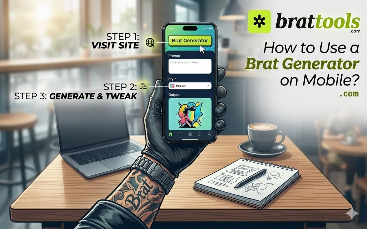
Using a brat aesthetic generator is simple and quick. You don’t need to learn any design tools. Just follow these steps:
This process usually takes less than a minute, which makes it perfect for fast content creation.
A free brat aesthetic generator online removes all the usual barriers of design. You don’t need:
Everything works directly in your browser. This makes it easier for creators, students, and social media users to experiment with ideas without wasting time.
Because it is fast and accessible, people use it repeatedly to create multiple variations until they find the perfect design.
Traditional design focuses on layers, graphics, and detailed visuals. Brat inspired text takes the opposite approach. Instead of complexity, it uses:
This makes brat-style visuals more effective for modern platforms where attention spans are short.
This tool is not limited to one type of content. It can be used in multiple ways:
Because the style is flexible, it works for both casual users and serious creators.
Color is what grabs attention first in brat-style design. The signature green from Brat feels bold and rebellious, which makes people stop scrolling. Pink gives a softer, playful look, while black creates a sharp and strong feel. White keeps things clean and easy to read, and blue or custom shades help create variation.
The key is contrast. Clear difference between text and background makes your design more visible, especially on TikTok and Instagram.
If your goal is attention, color choice matters more than anything else.
Not every aesthetic works the same way. The brat aesthetic stands out because it focuses on impact, not decoration.
The style comes directly from Brat, where the design is stripped down to the basics: bold text, flat background, and strong contrast. There are no extra elements, no complex graphics, and no detailed visuals. Everything is built to grab attention instantly.
Compare that with other popular aesthetics:
Minimalist aesthetic
Minimal design also uses fewer elements, but it feels calm and neutral. Brat is louder and more aggressive in how it presents text.
Y2K aesthetic
Y2K designs are full of shiny effects, gradients, and layered visuals. Brat removes all of that and keeps things flat and direct.
Grunge aesthetic
Grunge uses textures, noise, and rough visuals. Brat may use slight effects, but it stays clean and readable.
Soft aesthetic / pastel style
These rely on light colors and gentle visuals. Brat uses high contrast and bold tones instead.
The main difference is clarity. Most aesthetics try to create a mood through visuals. The brat aesthetic delivers the message first, then builds the style around it.
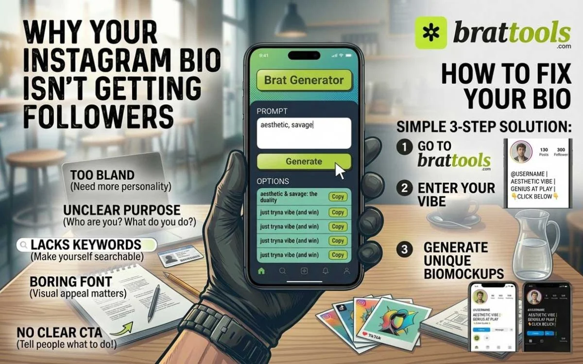
Your bio is one of the first things people notice on Instagram. A clean brat-style text can make it stand out instantly without adding clutter.
The brat aesthetic works well here because it focuses on short, bold text that is easy to read on small screens. Instead of long sentences or complex fonts, it keeps everything simple and direct.
How to use brat aesthetic in your bio
Start with a short phrase. One to three words work best. This keeps your bio sharp and easy to remember.
Use lowercase text. This matches the original brat style and gives a clean, consistent look.
Choose high-contrast colors if your profile supports it (like highlight covers or linked visuals). Bright green, black, or white usually work best.
Avoid adding too many symbols or emojis. The strength of this style comes from clarity, not decoration.
What works well in brat-style bios
Example ideas
Why it works
Most bios get ignored because they are too long or hard to read. Brat-style bios are different. They are quick to scan, easy to understand, and visually clean.
This makes your profile look more intentional, which helps whether you are building a personal brand, running a theme page, or just trying to stand out in a crowded space.
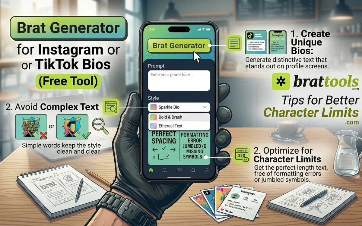
Fine-tuning makes your design look clean and professional without adding extra elements.
Keep spacing balanced
Adjust letter spacing slightly so text feels tight but readable.
Use strong contrast
Pick colors that clearly separate text and background for better visibility on TikTok and Instagram.
Stick to one alignment
The center works best for most designs. Keep it consistent.
Limit effects
Use only one effect (blur, noise, mirror) if needed. Avoid stacking effects.
Design for mobile first
Make sure text is readable on small screens.
Stay consistent
Use the same font, colors, and layout if you’re creating multiple posts.
Test quick variations
Try 2–3 versions with small changes and pick the clearest one.
The focus should always be clarity, not complexity.
The brat aesthetic is not just for posts or memes. It can also be used to build a strong and recognizable brand identity.
The style comes from Brat, where bold text and simple visuals create instant recognition. The same idea can be applied to branding.
Why it works for branding
The design is easy to remember. Bold text and flat colors make your brand stand out without needing complex graphics.
It stays consistent. Using the same font style, colors, and layout across posts helps people recognize your content quickly.
It is fast to create. You don’t need advanced design skills or heavy tools to maintain your brand look.
How to use it for branding
Keep one main color palette. For example, stick to green, black, or white across all designs. Use the same font style in every post. This builds a clear visual identity. Keep text short and direct. Long messages weaken the impact.
Apply the same layout structure. This makes your content feel organized and professional.
Where to use it
The brat aesthetic became popular because it fits how people consume content today—fast, simple, and easy to understand.
It started gaining attention after Charli XCX released Brat. The bold green background and minimal text style quickly turned into a visual trend across the internet.
Reasons behind the trend
Instant attention
Bold text and high-contrast colors stop users while scrolling, especially on TikTok.
Easy to recreate
Anyone can make brat-style designs without design skills. This made the trend spread quickly.
Works on all platforms
The style looks clear on Instagram, stories, reels, and thumbnails.
Minimal effort, strong impact
No complex graphics are needed. Just text and color can create a strong visual.
Trend-driven culture
People like using styles connected to music and pop culture. The brat aesthetic became a way to stay relevant.
Brat green is the signature color linked to Brat. It’s a bright, neon-like green that instantly grabs attention.
Hex code for brat green:
#8ACE00 (commonly used version)
Some tools and designs may use slightly different shades, but they all stay close to this high-contrast lime green tone.
Why this color matters
It stands out immediately. The brightness makes it hard to ignore, especially in fast-scrolling feeds. It creates identity. When people see this shade, they often connect it with the brat aesthetic.
It improves readability. When paired with black text, it creates a strong contrast that works well on platforms like TikTok and Instagram.
Best ways to use brat green
Use it as a background with dark text for maximum clarity. Avoid mixing it with too many other bright colors. Keep the design simple so the color remains the main focus.
This color is not just a style choice. It is a key reason why brat designs are easy to recognize and perform well online.
The brat aesthetic generator is more than just a trend tool. It reflects how digital content is changing. People now prefer designs that are fast, clear, and easy to understand.
By combining bold typography with simple layouts, this style makes it possible to create high-impact visuals in seconds. Whether you are experimenting with brat aesthetic text, testing new fonts, or creating content for social media, this approach keeps your design clean and effective.
If your goal is to stand out without overcomplicating things, brat-style design is one of the easiest and most reliable ways to do it.